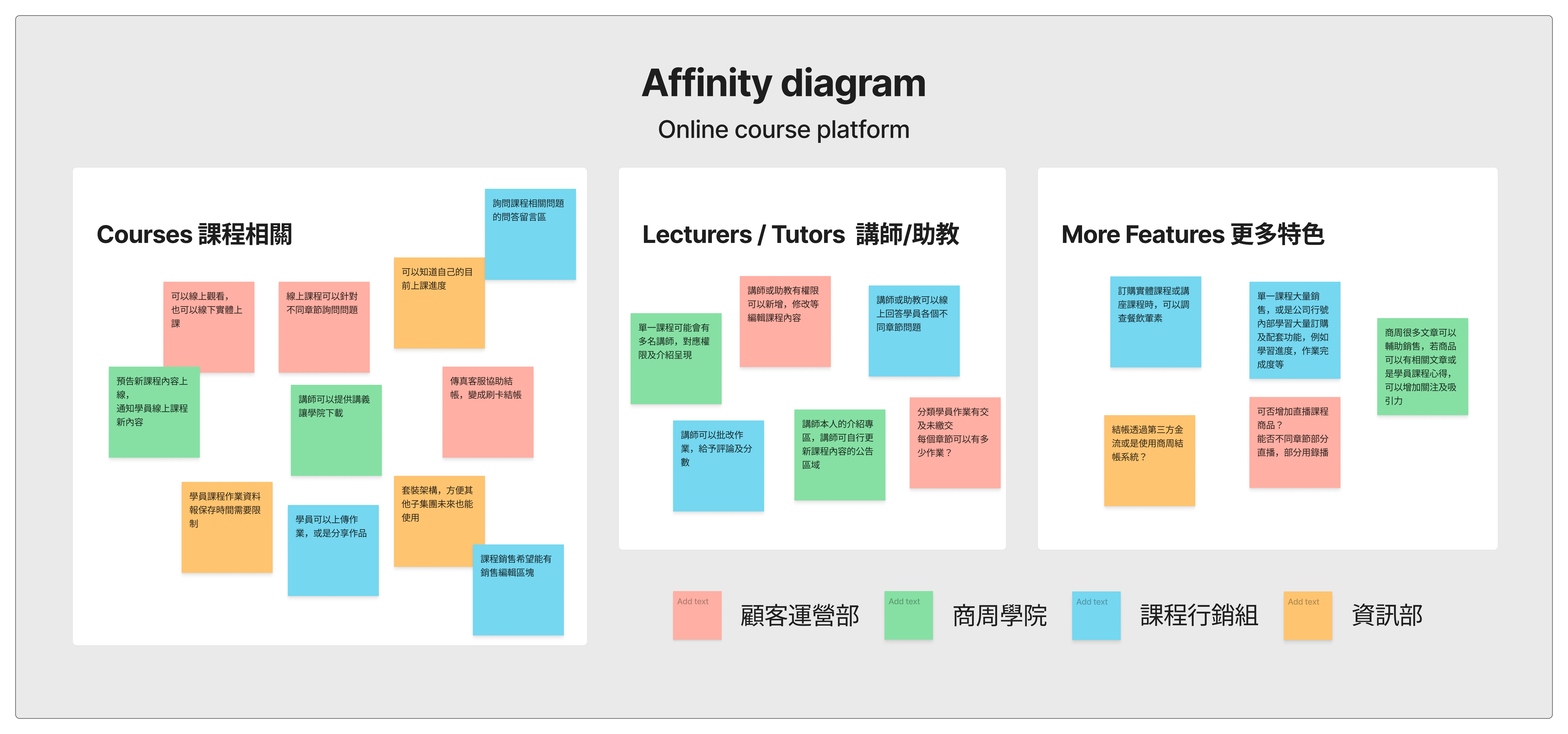
No online store or platform to sell the courses.
Users are difficult to find the courses, so it also hard to sell.
Payment also needs the artificial assistance by service department
Course data and document all need to be printed by assistants
If students have questions after class, they couldn't easily ask the lecturer.
When clients are interested in the course we promote online, they only can ask service center, it may not be a good idea because thay are not familiar with those courses.


High-priced courses need an extra promotion page.
Physical courses are more expensive than many other online courses, so we added online features to let users feel more satisfied with their experience.
Some physical courses will need to order meals.
A great amounts of orders need another path to process; besides, more expensive courses still need a path to service center.
Set the time limit to prevent the valid homework upload from students.
More notices on the navigation or somewhere on the page to tell lecturers and students the message is coming.
Most users of our platform is around 40-55 years old, when we try to make more contrast on the color, we still have to make their eyes feel well. So we tried to use #c6ae88 and white to be the main colour contrast.
Easy to follow our read habits and keep the page logical and organized.
Make sure the courses are all easy to read and clickable.
Make sure the text is large enough to read; have a text size of at last 16 px. Emphasizing information in bold is easier to our user to read.
Online course platform is one of the significant structures of e-commerce. There are so many tiny things and details that need to be concerned about, different courses, ages, backgrounds, and amounts of payments all let you know that they have various needs.
In addition, how perfectly cooperating with the sales team and development team is another challenge in the project, I have to spend much time balancing aspects of the demands and the supplies, and prevent conflicts and arguments, especially in a big group company.
First, I started this platform from 0 to 1 including the design for the front-end and back-end. Second, I thought the best experience is to work with different departments in a large group and gained much know-how.
I believe that I have both start-up and large company work experience and will be an asset for me to face the next challenge.